In the Expected Average Raises Versus Experience, I showed that if you took a group of 4 exemplary employees:
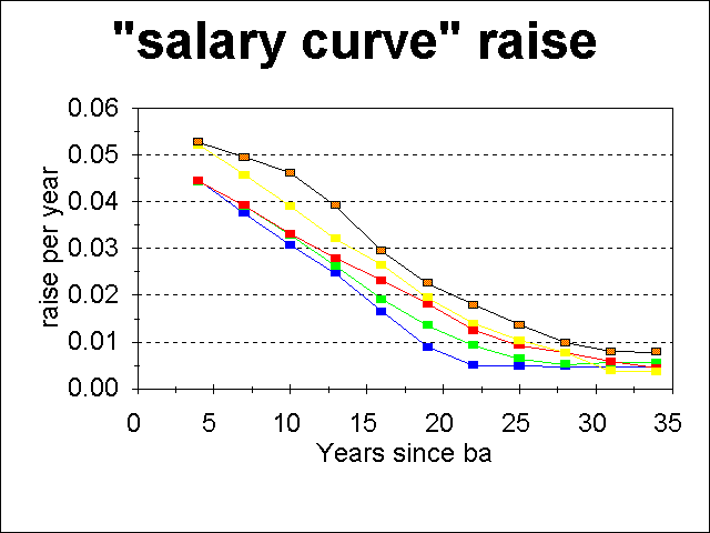
The average inflation-adjusted raise per year at any point on the salary curve is shown below:
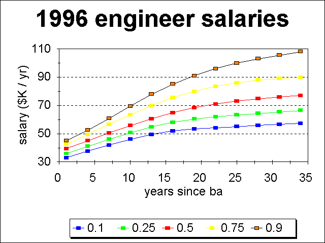
The plotted curves represent the same percentiles shown on the salary curve shown earlier, the 10, 25, 50, 75 and 90th percentiles, still in order from bottom to top.
In the following, I have approximated the actual distribution of raises versus percentile by weighting the number of people at a given percentile in the following way: assume that 15% of everyone is at the 10th percentile, 20% at the 25th, 30% at the 50th, 20% at the 75th, and 15% at the 90th.
The raise histogram resulting from assuming a uniform distribution of experience levels from 0 to 33 years is:
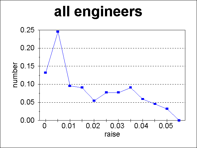
Note that most of the increases are near 0, with the tail toward higher raises coming from the younger employees. In this case, 1.9% of the "average raise" must go toward moving people along the salary curve. Thus if you are more senior, with an expected 0.5% raise, your raise will be 1.4% lower than the "average raise", as defined by the total dollars given out in raises divided by the total salaries.
The U.S. has a very non-uniform distribution of ages caused by the "Baby-boom generation". Thus a more realistic distribution is to assume a more narrow distribution of ages.
The raise histogram resulting from assuming a uniform distribution of experience levels from 13 to 31 years is:
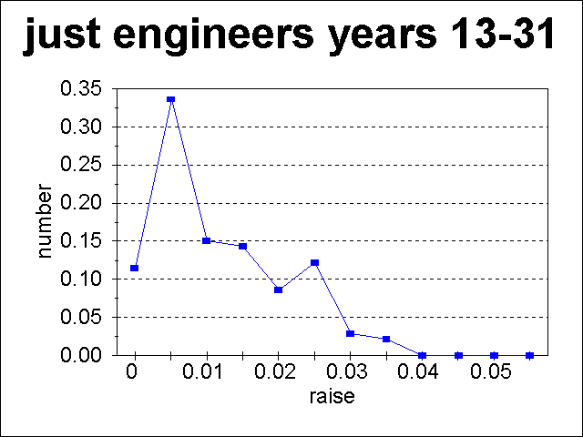
The higher raises have nearly vanished from the histogram, and "only" 1.5% of the "average raise" must go toward moving people along the salary curve.
The raise histogram resulting from assuming a uniform distribution of experience levels from 7-19 years is:
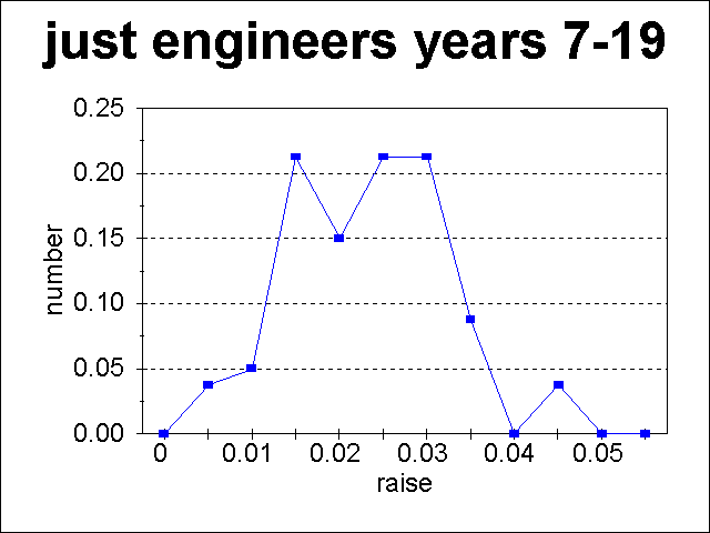
Now the raises that were nearly zero have vanished along with the higher ones, leaving a distribution that is closer to Gaussian. Because of the elimination of the older "0 raise" people, 2.6% of the "average raise" must now go toward moving people along the salary curve. Hence if you are one of the more experienced people, with an expected raise near 0, you are going to be pretty unhappy that your raise is nearly 2.6% lower than the average raise.
Go To:
Copyright © 1997 by Tom Chester.
Permission is freely granted to reproduce any or all of this page as long as credit is given to me at this source:
http://la.znet.com/~schester/calculations/salaries/detailed_expected_average_raises.html
Comments and feedback: Tom Chester
Last update: 25 September 1997.